Understanding Real User Needs
Before starting any design work, I followed a user-centered process rooted in design thinking. To identify pain points in the older versions of My Kumon (MKA) and My Centre (MCA), I conducted targeted surveys—reaching out to students for MKA and instructors for MCA. The aim was to gather insights on their experience across different features and workflows.
I also conducted on-site visits at Kumon centers alongside stakeholders, where I interviewed users and observed their behavior as they interacted with the apps. These real-world sessions were key to understanding not just what users were doing, but also the context behind their actions. It helped me define clear user personas based on actual behaviors, not assumptions—allowing the design to speak directly to their needs.
This early research phase shaped the design direction, helping reduce friction and making each interaction more goal-oriented and intuitive.
To learn design process that I've utilized to this project on earlier phrase of development, click the button below.
Case Study: My Kumon Application (MKA)
Pain points
Through surveys, direct interviews, and on-site visits with users and stakeholders, I identified several critical pain points:
Login and Onboarding Friction
Users, especially new ones, struggled with confusing sign-in flows and unclear guidance, which caused frequent drop-offs and support inquiries.
Lack of Student Account Overview
There was no unified view for parents to see all their children’s student profiles and their current statuses (e.g., trial, active, pending). This made account management confusing and inefficient.
Slow Search Experience in Audio & Answer Book Features
The system performed a search query with every single keystroke, resulting in slow performance when accessing large databases—especially in features like audio and answer book lookup.
Non-Responsive UI and Platform Limitation
The previous version of the application was available only as a mobile app, which limited flexibility for users—especially parents—who preferred managing tasks on a desktop. There was no browser-accessible version, and the UI was not optimized for varying screen sizes.
Project Goals
-
Streamline login and reduce friction for new users
-
Restructure content for better clarity and discoverability, including a complete revamp of the UI system to ensure visual and functional consistency across the entire app
-
Introduce a parent-level dashboard to manage multiple student accounts
-
Improve performance of search features within audio and answer book tools
-
Expand accessibility by enabling the application to run on web browsers—both on desktop and mobile—while delivering a fully responsive, intuitive experience across devices.
Key UX Challenges
-
Reducing drop-off during login and account creation
-
Organizing scattered features into a unified layout
-
Enabling parents to manage multiple students efficiently
-
Solving performance bottlenecks in search-heavy areas
-
Creating a responsive UI system that feels consistent and intuitive across devices
-
Communicating design logic across diverse technical stakeholders
Design Solutions
Secure and Guided OTP Login
Introduced a one-time password login system with clear guidance and user-friendly error handling. Users are now guided based on their registration status, with redirect paths for new sign-ups.
Parent Dashboard for Student Overview
Designed a centralized dashboard showing all student profiles, learning statuses (e.g., trial, active, pending), and quick-access actions such as document downloads, progress tracking, or enrollment updates.
Optimized Audio & Answer Book Search
Replaced real-time search-on-input with a manual search button. This small UX change dramatically improved performance by reducing backend load and improving user control.
Responsive Design
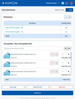
Built a responsive layout using a scalable grid system, ensuring smooth performance and usability across desktops, tablets, and smartphones. Tap areas were optimized for touch, while content spacing and alignment were refined for readability.
UI System and Visual Consistency
Established a unified UI component system for buttons, forms, cards, and navigation—ensuring consistent styling and behavior throughout the platform. This system also improved development efficiency and cross-platform maintainability.


Outcome
-
Faster and smoother search in audio and answer book features led to better user flow and fewer support complaints.
-
The Parent Dashboard significantly improved account visibility and made multi-student management effortless.
-
Onboarding friction decreased, with fewer user drop-offs and clearer account registration pathways.
-
The responsive UI ensured a consistent experience across mobile and desktop browsers—meeting real-world usage demands.
-
Stakeholders and users responded positively to the clearer layout, faster interactions, and polished interface.
Reflection
This project was a deep dive into bridging research insights with real product execution. Working closely with instructors, students, and international stakeholders allowed me to translate complex user needs into clear, usable interfaces.
Designing a consistent and scalable UI across web and mobile helped build a strong foundation for the future growth of the platform—and many of the systems created for MKA were adapted for the project: the My Centre Application (MCA).


